
Data Visualization: Your Gateway to Enhanced Decision-Making Strategy
Discover a variety of powerful data visualization tools, compare their benefits, and integration options to make an informed decision

.png)
In the past, creating smart data visualizations was considered a skill that was nice to have. But things have changed. Visual communication has become an essential skill for all managers, as it helps to understand and make sense of their work.
Visualization software is useful for analyzing complex systems and understanding statistical information by showing patterns and anomalies. The good news is that there are a lot of affordable tools, making it more straightforward for everyone to turn data into visuals.
However, it's important to remember that such communication is more than just making charts - it requires planning and strategy. In this article, we will take a look at the best data visualization software available on the market and explain what features to consider when selecting such tools.
What Is Data Visualization?
Data visualization is representing information visually through charts, graphs, and other elements to facilitate understanding and gain insights.
It helps managers find hidden patterns and trends in the raw data. Plus, it makes information easy to understand for people who aren't tech-savvy. For example, a retail company might use a bar chart to show how sales are doing in different areas or a color-coded map to highlight customer preferences across locations. The whole point of data visualization is to increase information clarity, enabling more intelligent decision-making while also transforming boring data into exciting and meaningful insights.

Definition and Explanation
Data visualization is the process of creating graphical representations of data to better understand and analyze complex information. It involves using various techniques and tools to transform raw data into visual elements such as charts, graphs, maps, and more. The goal of data visualization is to make data more accessible, easier to understand, and to facilitate data-driven decision-making.
What Are Data Visualization Tools?
Data visualization tools are software that helps convert original data into visually appealing and meaningful representations. These tools are valuable for data analysis, as they provide a visual context that makes it easier to understand patterns, trends, and relationships within the data.
Data visualization tools are incredibly versatile and can be used in various ways depending on the field you're working in:
- In marketing, they help analyze web traffic and social media data to understand customer behavior and trends.
- In finance, tools like line graphs help investors keep track of price changes over time for smarter decisions.
- Even in health policy, it is used to analyze population health stats, such as disease prevalence, demographics, and health outcomes.
Why Are Data Visualization Tools Important?
Data visualization tools make it easy to share complex information with everyone, whether they're tech-savvy or not, make better decisions by showing important details visually, and help understand the data more clearly.
Here are the main benefits of data visualization tools:
Data Clarity
Turn complex data into visuals to make it easier to understand and analyze and get a clear picture of the information at a glance. Using the best data visualization tools can significantly enhance the clarity and effectiveness of your data presentations.
Insight Discovery
Explore data and uncover hidden insights and patterns. This helps you spot trends, connections, and outliers that can guide decision-making and spark innovation.
Effective Communication
Present information in visually appealing ways. Effectively share complex ideas, present findings, and capture the attention of your audience.
Decision Making
Get a comprehensive view of the data, allowing you to quickly analyze, interpret information, and make data-driven decisions.
Methods for Visualizing Data
There are several methods for visualizing data, each with its unique strengths and applications:
- Bar Charts: A bar chart uses bars to represent data, making it easy to compare different categories or groups. Bar charts are ideal for visualizing discrete data and highlighting differences between groups.
- Pie Charts: A pie chart uses a circular graph to represent data, with each slice representing a proportion of the whole. Pie charts are effective for showing the relative sizes of parts to a whole, but they can become cluttered with too many categories.
- Line Charts: A line chart uses lines to represent data over time, making it perfect for visualizing trends and changes. Line charts are commonly used in time series analysis to show how data points evolve.
- Heat Maps: A heat map uses colors to represent data density, making it easy to identify areas of high and low concentration. Heat maps are useful for visualizing large datasets and spotting patterns that might not be immediately apparent.
- Scatter Plots: A scatter plot uses dots to represent data points, showing the relationship between two variables. Scatter plots are excellent for identifying correlations and trends in bivariate data.
Features to Look for in a Data Visualization Tool
With so many data visualization tools to choose from, finding the perfect solution for your needs can be a challenge. You want a tool that gives you insights and helps you focus on what really matters. As you search for the right solution, keep these important points in mind to find a tool that strikes the right balance between functionality, adaptability, and ease of use.
Intuitive and User-Friendly Interface
A data visualization tool with an intuitive and user-friendly interface lets you easily add and arrange visual elements using a drag-and-drop tool. It has helpful interactive controls and tooltips that guide you as you explore the data. Plus, a neat layout and easy-to-use navigation make the tool a pleasure to work with.

Diverse Chart Types and Customization Options
Data visualization tools should give you the flexibility to display information in the best way possible. You can actively select from a variety of charts such as bar, line, or pie charts to accurately represent your data. By customizing the appearance, colors, and labels, you can create engaging visualizations that are adjusted to your specific needs.

Interactive and Dynamic Visualizations
This will bring your data to life and put you in control. You can actively explore and manage the visualizations by zooming in, panning around, and applying filters to focus on specific aspects. With dynamic features, you can see real-time updates and animations that show changes over time or are based on different inputs.

Data Integration and Connectivity
You should have the ability to actively connect to databases, spreadsheets, or cloud storage, to have access to the data you need. This integration helps combine and visualize stats from different systems, helping you to create a unified view of your information for better decision-making.
Sharing Capabilities and Collaboration
With such features, you can export visualizations as images or interactive files to share with colleagues or stakeholders. Collaborative elements allow several users to work together on the same visualization, enabling real-time feedback and contributions, which leads to better teamwork and communication.
7 Data Visualization Tools, Overview, Pros & Cons
Let's take a look at the top-ranked data visualization tools and explore their strengths and weaknesses.
Looker Studio (Formerly Known as Google Data Studio) for Data Visualization

Google Looker Studio (formerly Google Data Studio) is a data visualization tool that syncs multiple sources into one reporting experience. It allows users to create informative and visually appealing dashboards that are easy to interpret, customize, and share. With support for over 800 data sources and 600+ data connectors, Looker Studio offers a wide range of options for data integration.
Pros of Looker Studio
- Affordable platform with a free basic version that offers variety of features.
- Intuitive dashboard and report creation with drag-and-drop functionality.
- Convenient templates that speed up the process and increase productivity.
- Native integration with Google BigQuery data warehouse.
- Versatile and customizable options for personalized reports.
- Access to many data sources from partner connectors.
- Convenient report sharing and collaboration features.
- Easy integrations with popular Google tools.
- Data governance that ensures compliance with regulations.
Cons of Looker Studio
- Lack of transparent pricing for the Pro version.
- Additional costs for some integrations.
- Limited customer support for free users.
- Potential challenges for larger organizations with the free version.
- Occasional lagging issues during larger projects.
Overall, Looker Studio provides affordable and intuitive data visualization and reporting capabilities, but it's important to consider the potential limitations and additional costs associated with certain features and integrations.Learn more about Looker Studio in our article with real-life case studies.
Microsoft Power BI for Data Visualization

Microsoft Power BI is a collection of online tools by Microsoft that helps you understand data better. It turns raw data into easy-to-understand visuals like charts and tables. Power BI includes different tools like apps, software services, and connectors that let you create reports and dashboards.
Pros of Microsoft Power BI
- Cost-effective pricing plans with a free version.
- Customizable visualizations for unique reports and dashboards.
- Integration with Microsoft tech stack (incl. Excel).
- Connectivity to various data sources for analysis.
- Regular updates and improvements based on user feedback.
- Embedding reports into other applications for extended reach.
Cons of Microsoft Power BI
- Struggles with complex table relationships.
- Limited options for customizing visualization.
- Overwhelming interface with numerous icons and options.
- Challenges with the DAX expression language and formula issues.
- Limitations on data input and processing large amounts of data.
- Requires additional time and effort to master the full suite.
Tableau for Data Visualization

Tableau is a rapidly growing tool that allows users to transform unprocessed data into visually appealing and interactive dashboards. Scientific visualization is a key component in the growth of the data visualization market, driven by technological advancements and the need for effective visual analytics in both small and large enterprises.
It is highly popular and user-friendly, with a large fan base in the public and enterprise sectors. One of its greatest advantages is its simplicity and speed, as it does not require technical or programming skills. Tableau offers features like real-time analysis, collaborative data exploration, and data blending capabilities.
Pros of Tableau
- Strong, secure performance for handling large data sets.
- Accessible on the go through a mobile app.
- Active and supportive community with resources and forums.
- Mobile BI support for easy deployment on mobile devices.
- Seamless upgrades to access the latest features.
- Cost-effective compared to other big data tools.
- Responsive customer support and community help. User-friendly interface with drag-and-drop functionality.
Cons of Tableau
- Lack of revision history support in older versions.
- Manual report refreshing without automated scheduling.
- Inability to revert to previous data levels after publishing.
- Difficult to create datasets from multiple sources.
- Requires SQL knowledge for certain tasks.
Qlik for Data Visualization

QlikView is a powerful tool for analyzing data and creating interactive dashboards. It offers many data visualizations, a customizable app, data security, API integration, real-time sharing, and compatibility with popular devices for accurate data interpretation and a complete view of business performance.
Pros of Qlik
- Access company information on the go with support for multiple mobile platforms.
- Reduce reliance on IT professionals for system maintenance, and saving costs.
- The affordable software solution that is suitable for businesses with budget constraints.
- Access to training materials that helps maximize software potential.
Cons of Qlik
- No phone support is available for immediate assistance.
- Companies may still need IT support during installation and implementation.
Google Sheets for Data Visualization

Google Sheets is a cloud-based spreadsheet application that allows users to create, edit, and share online spreadsheets in real time. It is suitable for individuals, businesses, and remote teams working on multiple devices. The app offers features such as built-in templates, functions for data analysis, visualization tools, collaboration options, integrations with other tools, and sharing options. Additionally, Google Sheets provides automation to streamline tasks and an Explore function for data exploration and insights.
Pros of Google Sheets and Google Charts
- Seamless integration with other Google apps for quick access and collaboration.
- Easy sharing options with customizable links and direct sharing.
- Real-time collaboration with up to 100 users editing simultaneously.
- Commenting and conversation features for effective communication.
- Advanced functionality with paid plans, including increased storage and additional features.
- Business benefits like custom emails and increased Google Meet participants.
Cons of Google Sheets and Google Charts
- Limited capacity of 5 million cells per spreadsheet compared to Excel's higher limit.
- Google Sheets may not be suitable for highly complex calculations and extensive data analysis compared to Excel.
- Limited availability for presenting important dashboards built in Google Sheets as the source of truth.
Microsoft Excel for Data Visualization

Excel is a great tool for creating visual charts to display your data analysis results. With charts, you can use bars or lines to represent your data and make it easier for others to understand important information. Excel provides different chart options to choose from, and you can even get personalized recommendations.
Pros of Microsoft Excel
- Easy to use and learn with a familiar interface and various functions.
- Can handle large amounts of data and do basic and advanced calculations.
- Provides built-in charting and graphing tools.
- Integrates with other Microsoft products and supports import and export.
- Suitable for beginners and non-technical users.
Cons of Microsoft Excel
- Errors and inconsistencies when working with complex formulas and multiple worksheets.
- Slow and unstable performance with large and complex data sets.
- Difficulties in collaboration and sharing due to file size and compatibility issues.
- Limited functionality and flexibility compared to advanced data analysis techniques.
- Not suitable to be presented as a data source of truth.
Google Analytics 4 for Data Visualization
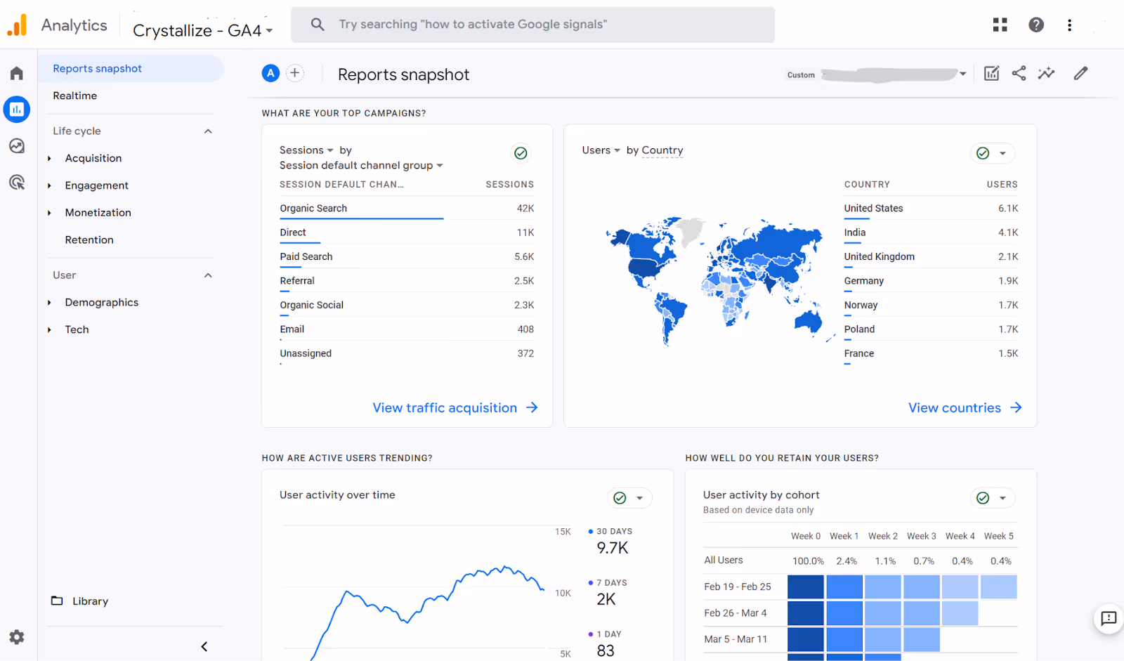
With customizable tables and a variety of visualizations like line charts, donut charts, geo maps, and scatter plots, GA4 helps go through your data and discover the meaningful information you're seeking. When using line charts, you can easily spot outliers with a customizable anomaly-detection model that helps you identify significant trends in your data.
Pros of Google Analytics 4
- Free and powerful analytics software.
- Simple setup, especially with website builders.
- Out-of-the-box reports for quick analysis.
- Ability to manage multiple websites under one account.
- Access to advanced data analysis features.
- Regular updates and new features.
- Insights on how people find your site.
- Real-time traffic data for immediate insights.
- Freely available resources for learning and support.
Cons of Google Analytics 4
- Technical jargon creates a steep learning curve for new users (even those who used GAU before).
- Overcomplicated for non-technical users.
- Not enough granularity for non-google advertising ROAS reports.
- Data Sampling impacts data accuracy.
- High-cardinality dimensions can quickly cause reports to reach the row limit.
- Limited number of events collected per month.
- Limited customer support for the free version (vs expensive paid).
- Lack of attribution models.
- A lot of time is spent for interpretation to derive actionable insights from data.
Import Non-Google Ad Costs to GA4 with OWOX BI
You have 3 options to import cost data into GA4:
- Manually import CSV files through the GA4 interface,
- Use the GA4 SFTP method for data import,
- Leverage OWOX BI's out-of-the-box solution.
Each method helps you integrate non-Google ad data seamlessly, providing a complete view of your advertising performance in Google Analytics 4.
💡 To fully understand your advertising performance in GA4, integrating non-Google ad costs is essential. For a seamless integration, explore our comprehensive guide on how to import cost data using various methods, including an out-of-the-box solution offered by OWOX BI. This helps you choose the best approach to ensure your data is complete and insightful.
Data Visualization with OWOX BI
With OWOX BI, data visualization makes untouched data meaningful and useful. Users have complete control over data collection and preparation for reporting, and can easily track its flow on the workspace and identify any issues through data lineage graphs.

Flexible reports cover the entire customer journey, and smart dashboards templates designed specifically for marketing professionals, show key performance metrics that matters for you.
OWOX BI provides quick and easy setup flow so you can get your marketing reporting built in minutes (from data collection and on-site analytics setup to ready-to-analyze reports), providing you with a comprehensive view of the marketing KPIs, and the insreument for data-driven decision-making for better ROI.
Best Practices for Data Visualization
Creating effective data visualizations requires following best practices to ensure clarity and impact:
- Keep it Simple: Avoid cluttering the visualization with too much data or unnecessary elements. Simplicity helps the audience focus on the key insights.
- Use Color Effectively: Use color to highlight important data points or trends. Be mindful of color choices to ensure accessibility for all viewers, including those with color blindness.
- Use Labels and Annotations: Provide context and explanations through labels and annotations. This helps the audience understand the data and its significance.
- Avoid 3D Visualizations: Unless necessary, avoid using 3D visualizations, as they can be distracting and difficult to interpret. Stick to 2D visualizations for clarity.
- Test and Refine: Test the visualization with different audiences and refine it based on feedback. Iterative improvements ensure the visualization effectively communicates the intended message.
Tips and Tricks
Enhance your data visualizations with these tips and tricks:
- Use Storytelling Techniques: Incorporate storytelling techniques to make the visualization more engaging and memorable. Narratives help convey the data’s significance and context.
- Use Interactivity: Allow users to explore the data in more detail through interactive elements. Interactivity can reveal deeper insights and make the visualization more engaging.
- Use Animation: Show changes over time or highlight important data points with animation. Animated visualizations can effectively demonstrate trends and dynamics.
- Use Data Visualization Tools: Leverage data visualization tools to create interactive and dynamic visualizations. Tools like Tableau, Power BI, and Looker Studio offer powerful features for crafting compelling visuals.
- Practice and Experiment: Continuously practice and experiment with different visualization techniques and tools. Finding what works best for your data requires exploration and creativity.
By following these guidelines and utilizing the right data visualization tools, you can transform raw data into insightful and impactful visualizations that drive informed decision-making.
Transform your data into insights with just a few clicks

Conclusion
Ultimately, data visualization isn't just about pretty pictures; it's about empowering us to see the stories hidden within the numbers. It's about transforming raw, often overwhelming data into clear, actionable insights that drive better decisions.
By choosing the right tools – whether it's a robust platform like Google Analytics 4 or the familiar simplicity of Google Sheets – and applying effective visualization techniques, we can unlock the full potential of our data. From identifying subtle trends and patterns to communicating complex information effectively to a wider audience, data visualization bridges the gap between raw data and human understanding.
Frequently asked questions


Finally, a tool that doesn't ask business users to learn a new dashboarding UI. Our marketing team already knows Sheets. OWOX just delivers the right data.
Joinable data marts concept was the thing that sold us. We can now use the semantic layer without building one.
Self-hosted the OSS version on Digital Ocean. Zero vendor lock-in. Contributed a Shopify connector back in week two.