LTV: How to Use Available Data to Predict Customer Value
Are you struggling to identify high-value customers? Our success story reveals how data analytics can help you predict customer lifetime value.

Long-term growth is the essence of modern marketing, which focuses on turning one-time customers into regular and loyal ones. Using the LTV metric helps companies meaningfully personalize marketing: create solutions for personalized product recommendations and advertising campaigns.
However, when you formally obtain LTV using simple formulas, for example, through a churn rate, the results are often unsatisfactory for business. Using the example of a large e-commerce business, we show how to integrate user data into a single repository and select a calculation methodology using different customer cohorts.
Task
As the business wanted to use all available data to predict customer value, increase the customer lifespan and the LTV of the whole customer base, there were set such goals as:
- Segment customers based on their buying activity.
- Personalize communication with obtained customer segments, using digital communication and direct marketing channels (email, SMS, call centers).
Among the used tools were Google Analytics to collect and store user behavior data and a CRM system (Microsoft Dynamics) to collect data about completed orders. This data also should be merged (based on customers’ buying frequency) in a single data system for segmenting customers. Then, the obtained customer segments can be sent to ad services and used for displaying relevant ads and personalizing direct marketing communication.
Solution
Step 1. Merge data
Google BigQuery (GBQ) was chosen as a cloud data storage for merging the data, because of the high-security standards and simple integrations with other services. Whereas OWOX BI Pipeline was applied to send raw unsampled data about user behavior to GBQ, in near-real time.
With the help of the API and Client Libraries, the following data from CRM was transferred to Google BigQuery:
- Data about all orders, including the completed orders (online, offline, and through call centers).
- Customer user IDs, along with their personal data (name, gender, birthday, email address, phone number, registration date, loyalty program status, email, SMS subscription, etc.), as well as the data about customers’ buying activity (a number of orders made by a customer).
Here’s the dataflow schema:

Step 2. Process data
As our client was an omnichannel fashion retail business, there was a necessity to create its own customer segments with additional custom parameters.
The consumption cycle time of the customer base was set as 1.5 months ± 2 days to calculate the time period for segmentation. This value is the median number of days between the two neighboring orders. To check this median number, the number of days between the online orders was calculated, then the number of days between the offline orders, to get the weighted mean value for both types of orders.
Next, the main segment types were identified based on the calculated time period for such segments as:
- New members. Newly registered users who made no purchases.
- Old members. Old registered users who made no purchases.
- New buyers. Customers who made their first purchase.
- Good buyers. Customers who made 3 or more purchases within the last 6 time periods.
- Very good buyers. Customers who made the most purchases within the last 6 time periods. As the upper threshold for this segment, the OWOX BI analysts used the Transformation Rate (the percentage of customers who made a purchase within the reporting period). For example, a customer who bought something in each time period or in 4-5 of the 6 last time periods.
- Casual buyers. Customers who made a purchase in 1-2 of the last 6 time periods.
- Sleep buyers. Users who haven’t made a purchase within the last 6 time periods.
- Inactive. Users who haven’t made a purchase within the last 12 time periods.
Having specified the conditions for segmentation, the team created a schema of the possible user transitions between the customer groups. It’s critical to see the user migration from one segment to another within the analyzed time period and after communicating with customers through the digital and direct marketing channels.

The schema above demonstrates the percentage of users who switch to more active segments within a reporting period. The transition to more active segments is a positive tendency and is shown with green, while the transition to passive segments is a negative tendency and is shown with red. For example, you can see that 15% of registered users (New members) make the first purchase and become New buyers, which is a good tendency. 86% of people, who made a purchase in the previous time period, didn’t buy anything in the analyzed time period and eventually became Casual buyers, which is a negative tendency.
The OWOX BI analysts created user segments by applying SQL queries. As a result, they received a table containing UserIDs, personal user data, and the segment name.
Next, the table with the main efficiency rates for each of the segments was formed:
- The number of users in the segment and the segment percentage in the customer base.
- The number of orders: total and completed orders in a segment.
- The average revenue per user.
- The number of orders per user.
- The total number of orders and the segment share in the general turnover.
- The changes in the number of users in a segment (growth rate).
Step 3. Create reports
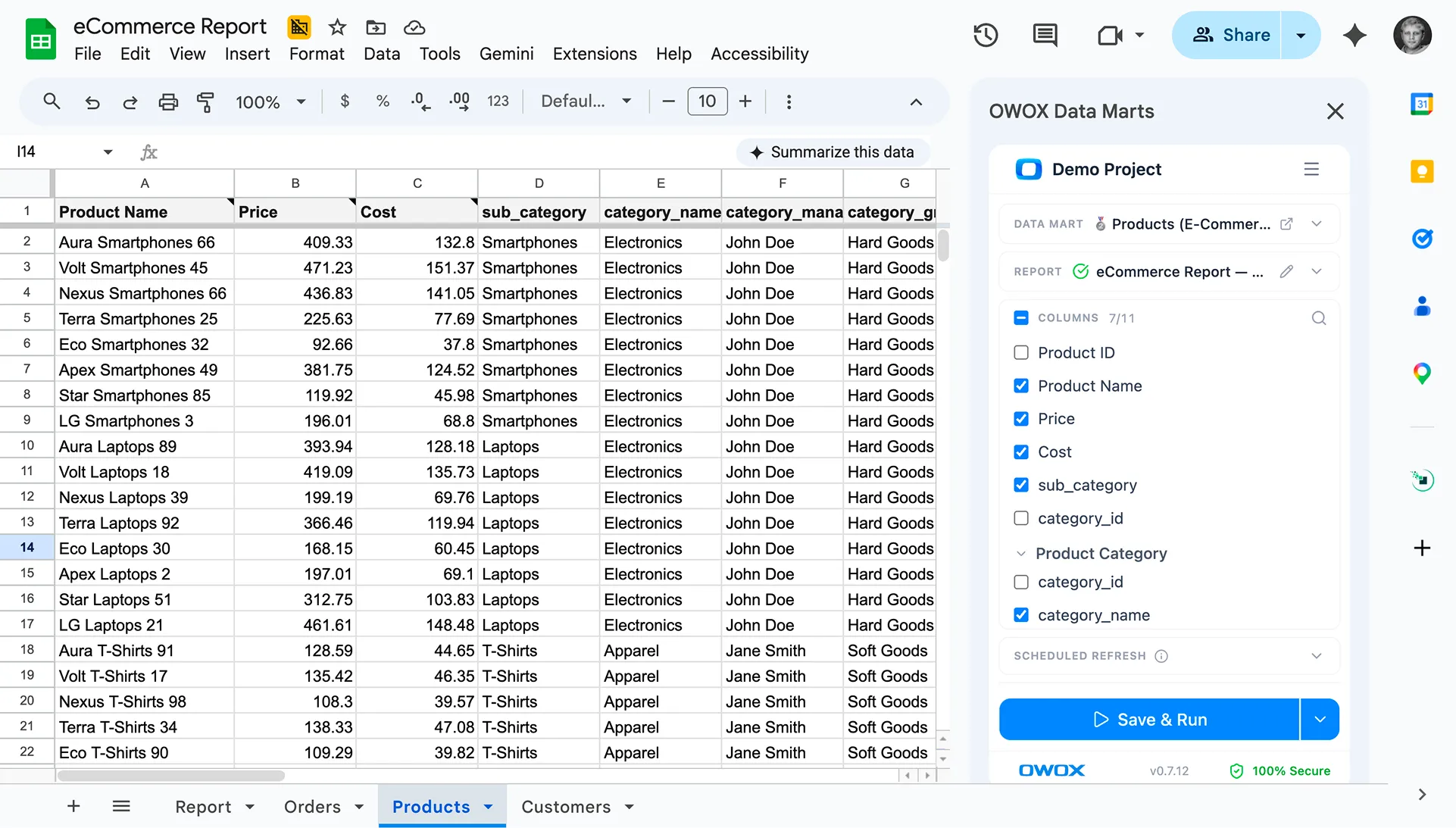
As the client prefers to create the reports via Google Sheets, the OWOX BI BigQuery Reports add-on was used as a simple and trusted way to transfer data from Google BigQuery. Let's see what reports were built based on the obtained data.
The first report reveals the number of users who transited to another segment or remained in the same one.

The Clients metric shows the number of users, the StartSegment column demonstrates the user segment in the previous period, and the EndSegment column demonstrates the user segment for the current time period. For example, in line 7 we can see how many customers switched to Good buyers from Casual buyers, and, again, it’s a good tendency. But we can see a totally opposite situation in line 10, which is a bad tendency. Line 5 represents customers who remained Inactive. It means that the business needs to communicate with these customers more often or more effectively and persuade them to start buying again after 6 time periods of being inactive.
The second report shows the current data on each user within a set time period.

It displays the current list of customers who were members of each of the nine segments. This report also shows all personal user data for direct communication: email address, phone number, birthday, name, gender, loyalty program status, average revenue per user, and the total number of user bonuses. With this data at hand, the marketing specialists can set up personalized ads for each user segment. For example, you can group Casual buyers with the 0101000 activity (2 purchases within 7 months), and send them an invitation to a secret sale.
Moreover, the information from the report helps to save ad budget, allowing to exclude huge segments of users from the target audience that the company already communicates with, using direct marketing channels. Also, this data can be enriched with more detailed information about each customer, allowing one to consider the brand, category, and price of customer choices while forming an ad strategy.
The third report indicates metrics of buying activity across the customer segments within the analyzed time period, compared to the previous period.

This report helps to track KPI changes for each customer segment:
- Revenue generated by a customer segment, and its share in the total company’s turnover.
- Comparative figures for buying activity: buying frequency and average revenue per user.
- Order completion rate: the percentage of orders that were paid out.
- Changes in the number of users from the active segments. A positive tendency shows user growth in active segments (Good buyers, Very good buyers, New buyers) and user reduction in the passive segments (Sleep buyers, Inactive, Casual buyers with the buying activity of ***000, **0000, and *00000). To get more detailed information on the segment changes, the schema of possible user transitions from one segment to another can be used. This schema also allows seeing how well the communication with customers was organized within the reporting period.
Results
- Using Google and OWOX BI tools, the e-commerce project managed to collect complete and detailed data for creating customer segments.
- The OWOX BI analysts helped to automate report creation. Now the important KPIs can be analyzed across customer segments and datasets, considering the data on each customer from any segment.
- The business enriched communication with its clients by applying detailed advertising campaigns.


